matplotlib基础
在使用Numpy之前,需要了解一些画图的基础。
Matplotlib是一个类似Matlab的工具包,主页地址为
导入 matplotlib 和 numpy:
python
%pylabUsing matplotlib backend: <object object at 0x00000233EAD475D0>
%pylab is deprecated, use %matplotlib inline and import the required libraries.
Populating the interactive namespace from numpy and matplotlib
plot 二维图
python
plot(y)
plot(x, y)
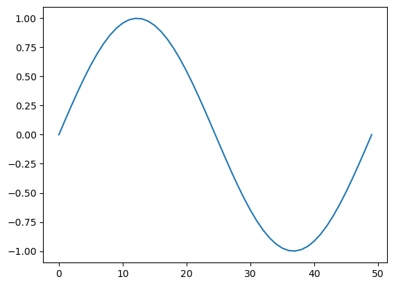
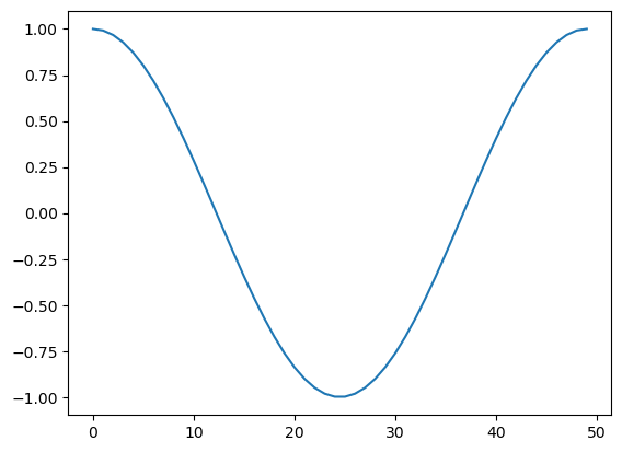
plot(x, y, format_string)只给定 y 值,默认以下标为 x 轴:
python
%matplotlib inline
x = linspace(0, 2 * pi, 50)
plot(sin(x))
[<matplotlib.lines.Line2D at 0x233ec308850>]
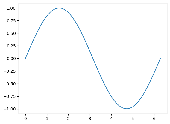
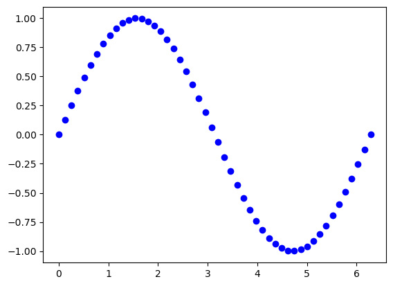
给定 x 和 y 值:
python
plot(x, sin(x))[<matplotlib.lines.Line2D at 0x233ee53cf90>]
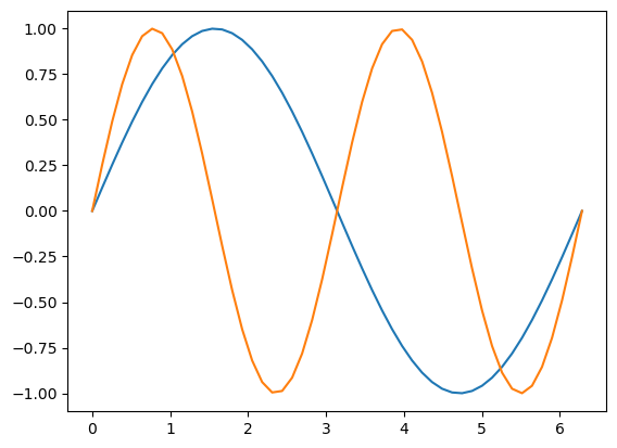
多条数据线:
python
plot(x, sin(x),
    x, sin(2 * x))
[<matplotlib.lines.Line2D at 0x233ef6b1110>,
<matplotlib.lines.Line2D at 0x233ef6e8710>]
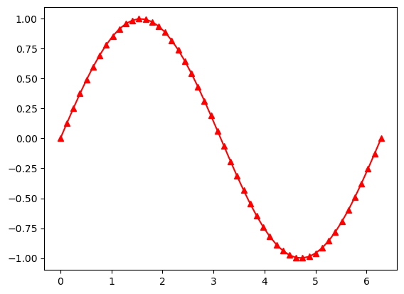
使用字符串,给定线条参数:
python
plot(x, sin(x), 'r-^')[<matplotlib.lines.Line2D at 0x233ef71ec90>]
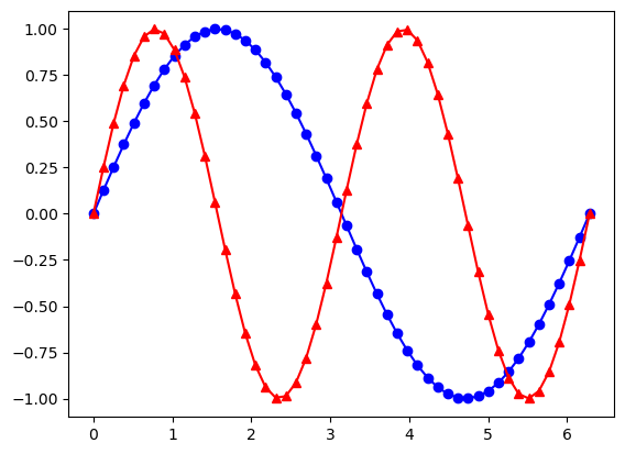
多线条:
python
plot(x, sin(x), 'b-o',
    x, sin(2 * x), 'r-^')
[<matplotlib.lines.Line2D at 0x233ef7c1550>,
<matplotlib.lines.Line2D at 0x233ef7ebc90>]
更多参数设置,请查阅帮助。事实上,字符串使用的格式与Matlab相同。
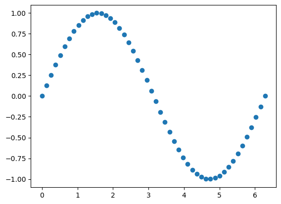
scatter 散点图
python
scatter(x, y)
scatter(x, y, size)
scatter(x, y, size, color)
假设我们想画二维散点图:
python
plot(x, sin(x), 'bo')[<matplotlib.lines.Line2D at 0x233ef867c50>]
可以使用 scatter 达到同样的效果:
python
scatter(x, sin(x))<matplotlib.collections.PathCollection at 0x233ef744790>
事实上,scatter函数与Matlab的用法相同,还可以指定它的大小,颜色等参数:
python
x = rand(200)
y = rand(200)
size = rand(200) * 30
color = rand(200)
scatter(x, y, size, color)
# 显示颜色条
colorbar()
<matplotlib.colorbar.Colorbar at 0x233ef8874d0>

多图
使用figure()命令产生新的图像:
python
t = linspace(0, 2*pi, 50)
x = sin(t)
y = cos(t)
figure()
plot(x)
figure()
plot(y)
[<matplotlib.lines.Line2D at 0x233ee664410>]
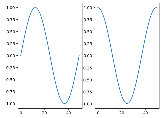
或者使用 subplot 在一幅图中画多幅子图:
subplot(row, column, index)
python
subplot(1, 2, 1)
plot(x)
subplot(1, 2, 2)
plot(y)
[<matplotlib.lines.Line2D at 0x233efb93b10>]
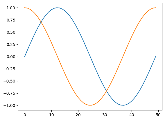
向图中添加数据
默认多次 plot 会叠加:
python
plot(x)
plot(y)
[<matplotlib.lines.Line2D at 0x233efc22950>]
可以跟Matlab类似用 hold(False)关掉,这样新图会将原图覆盖:
python
plot(x)
hold(False)
plot(y)
# 恢复原来设定
hold(True)
---------------------------------------------------------------------------
NameError Traceback (most recent call last)
Cell In[13], line 2
1 plot(x)
----> 2 hold(False)
3 plot(y)
4 # 恢复原来设定
NameError: name 'hold' is not defined
标签
可以在 plot 中加入 label ,使用 legend 加上图例:
python
plot(x, label='sin')
plot(y, label='cos')
legend()
或者直接在 legend中加入:
python
plot(x)
plot(y)
legend(['sin', 'cos'])
坐标轴,标题,网格
可以设置坐标轴的标签和标题:
python
plot(x, sin(x))
xlabel('radians')
# 可以设置字体大小
ylabel('amplitude', fontsize='large')
title('Sin(x)')
用 'grid()' 来显示网格:
python
plot(x, sin(x))
xlabel('radians')
ylabel('amplitude', fontsize='large')
title('Sin(x)')
grid()
清除、关闭图像
清除已有的图像使用:
clf()
关闭当前图像:
close()
关闭所有图像:
close('all')
imshow 显示图片
灰度图片可以看成二维数组:
python
# 导入lena图片
from scipy.misc import lena
img = lena()
img
我们可以用 imshow() 来显示图片数据:
python
imshow(img,
       # 设置坐标范围
      extent = [-25, 25, -25, 25],
       # 设置colormap
      cmap = cm.bone)
colorbar()
更多参数和用法可以参阅帮助。
这里 cm 表示 colormap,可以看它的种类:
python
dir(cm)使用不同的 colormap 会有不同的显示效果。
python
imshow(img, cmap=cm.RdGy_r)从脚本中运行
在脚本中使用 plot 时,通常图像是不会直接显示的,需要增加 show() 选项,只有在遇到 show() 命令之后,图像才会显示。
直方图
从高斯分布随机生成1000个点得到的直方图:
python
hist(randn(1000))更多例子请参考下列网站: